Lingua Compass
E-Commerce system for international summer camps
Take a look online
E-commerce
UX/UI design
Web
Responsive
Front End
Search
Places
Filters
Admin Panel
Travel
Education
Back End
Stripe
Pipedrive
Sendgrid
Wufoo
Past history
The customer approached us with a pre-existing logo, a more-or-less thought-out business model and a fixed budget for the first version of the web app. The main requirements were multiple language support, responsiveness, a convenient management system, a flexible curriculum filter and integration of a payment system that permitted transferring money to other companies.
THE PROTOTYPE
Where to start
We started working on the project with creating the prototype of the client side. In this particular project we decided to go further than a black and white prototype as it occasionally helps to determine the overall style.

It’s better to start the development process from the admin panel, because the interface prototype prevents misunderstanding and lets the customer get an idea of how everything is going to actually function.

The landing page
As a web app is being created it makes sense to gather info from potential involved clients. Even after the project is launched, this page can prove to be useful.

Illustrations
During project launch the attention was focused on language curricula for children and original, cute graphics that helped demonstrate the service's high quality.

The app's client end
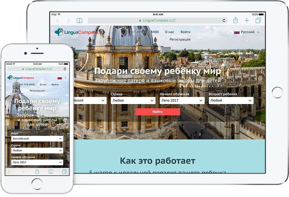
LinguaCompass looks great in desktop, phone and tablet browsers during all ordering stages up to the payment.

THE FILTER
Easy filter
for faster search
for faster search
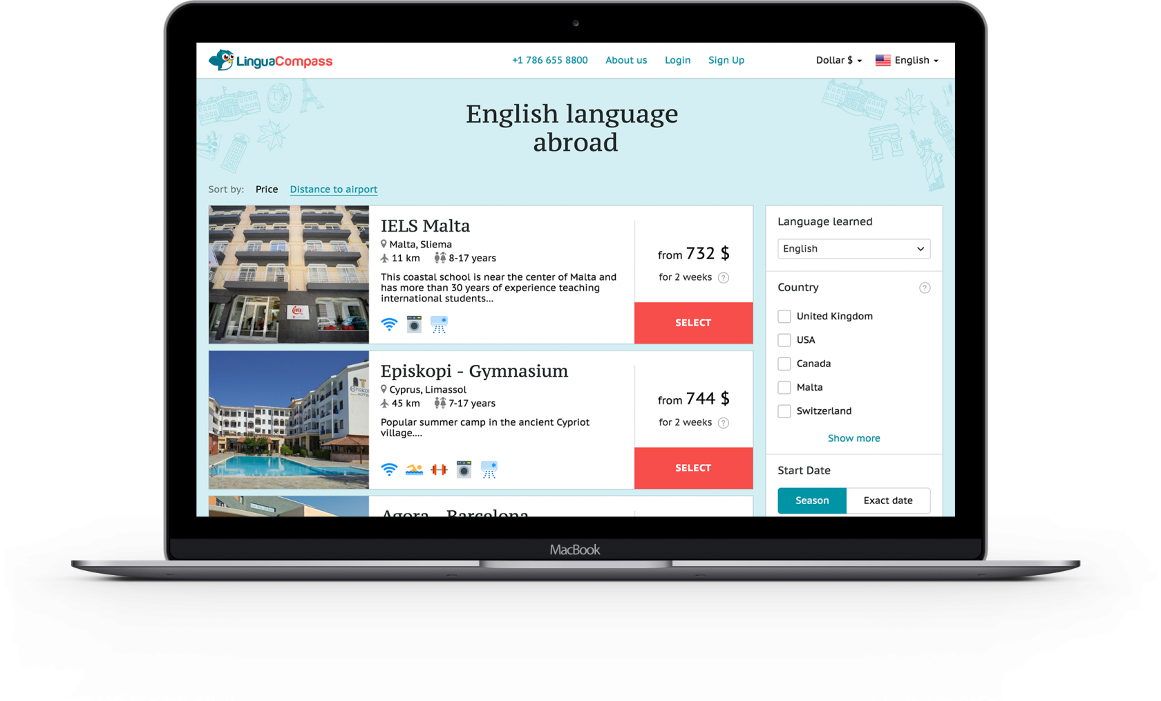
The complex summer camps filter works without resetting, but all the lists of the schools and curricula are fully indexed by search engines. The resulting choice of countries and languages is displayed in the page’s header. When filter parameters are changed, a suitable curriculum within each school is searched for, the cost is calculated and the least expensive option is selected.

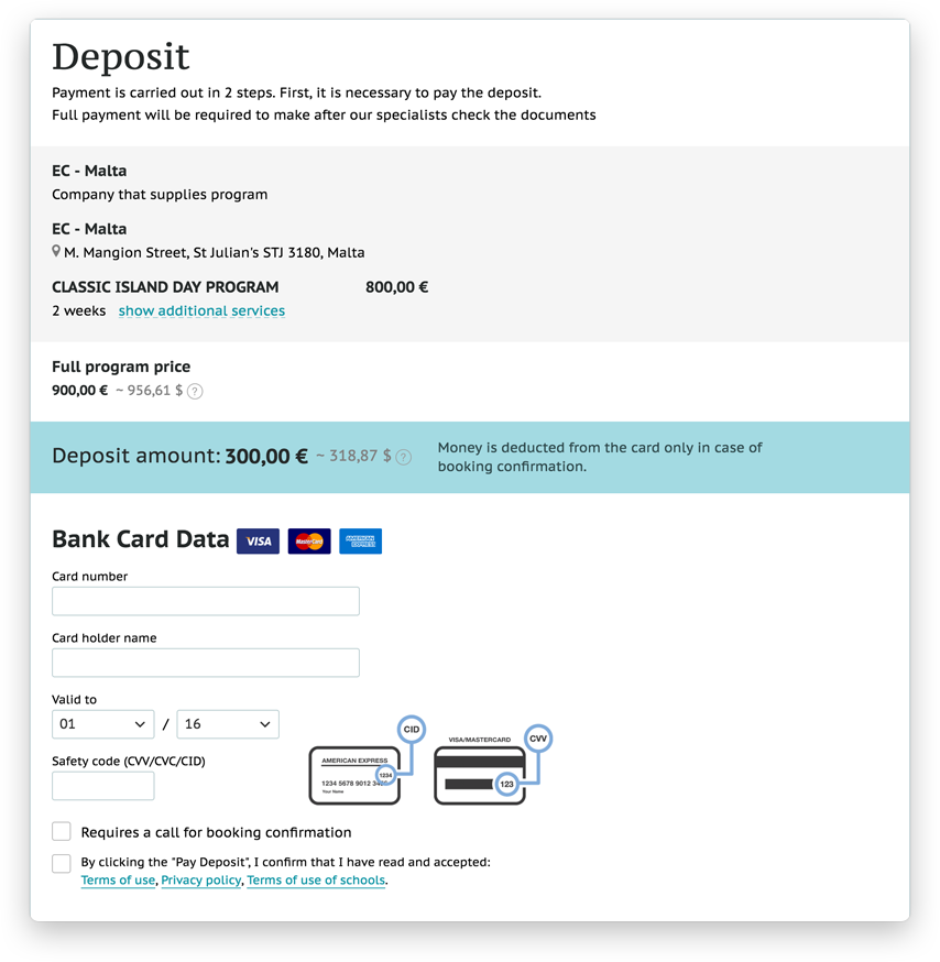
The payment page displays the payment procedure and allows the user to additionally check the selected services. Payments are carried out using Stripe.
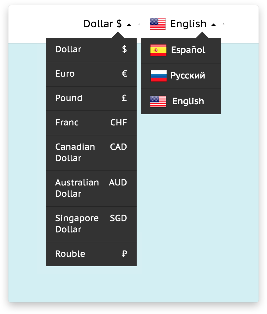
Page localization can be quickly switched on the spot and the cost is displayed in different currencies along with the exchange rate at the actual moment.
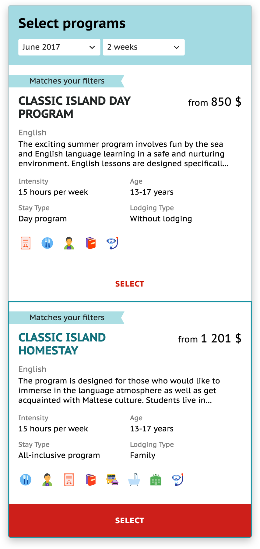
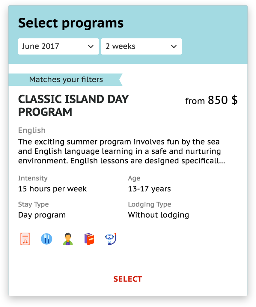
Minimized curriculum menu cards help the user pick a curriculum they need, and the cards can be expanded to fully calculate the cost of a curriculum with an immediate recalculation of the total price.


The admin panel
The website's admin panel permits adding data in three languages.
CRM
Ticket
processing
processing
After filling in the request the user is automatically registered in the web app, and the request is handled by managers using all the necessary data in the thoroughly integrated Pipedrive CRM system. Pipedrive has a column-based structure. When the customer creates a request or the request changes its status (the data is filled in the form, the deposit is paid, the reservation is confirmed, etc.), the manager moves the request from one column to another. We created the procedure of moving the request for comfortable work with Pipedrive. Depending on the column and the request’s status, the system automatically sends details, a bill or a request to fill in the form to the customer’s mail address.

THE PAYMENT
Two stages for complete security
The payment of an entire curriculum is divided into two parts. The primary deposit is required for handling the data and confirming the reservation in the language school; in fact, the money is withdrawn from the customer’s card only after confirmation. The customer is offered to pay the second and larger sum only after all the details are checked. The money is automatically transferred directly to the summer school.

Right now our team discusses with the customer the creation of different landing pages for particular countries and seasons. The main page, the search page and the program page will be reworked and made more user-friendly according to the results of our UX research.
Account manager
Vlad Korobov
Project manager
Daria Abramova
Vlad Korobov
Project manager
Daria Abramova
Designers
Sergey Popovich
Eva Rupenko
Sergey Popovich
Eva Rupenko
Front-end developers
Pavel Baibara
Alexey Fedorenko
Pavel Baibara
Alexey Fedorenko
Back-end developers
Olga Shiklo
Anton Mishin
Quality assurance
Igor Kurganov
Olga Shiklo
Anton Mishin
Quality assurance
Igor Kurganov


