Yodel
A task manager for work process supervision in fast food outlets
The goal
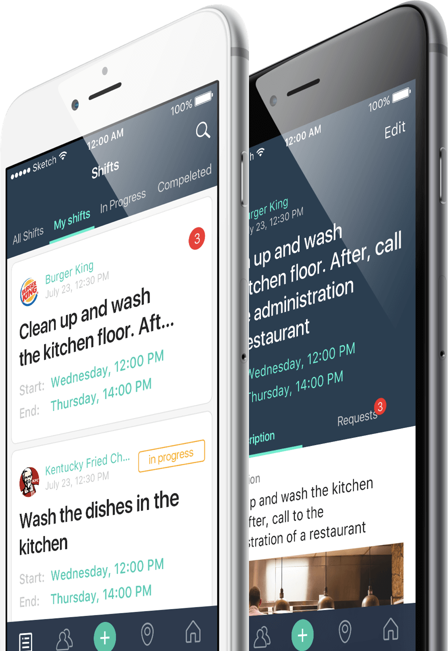
Yodel is a mobile app for scheduling and supervising tasks without knowing beforehand who is going to perform them. The manager sends out work requests for the employees to either accept or reject and invites suitable candidates. Each employee is assigned to a certain location. A manager or an admin sets up a work shift – a period of time for the task to be carried out
Past history
The customer has extensive experience in fast food service. Within 16 years the customer’s enterprise grew, increasing the workload for both managers and employees. New conditions demanded an overhaul of management and a higher degree of productivity
Having looked at the existing project management systems, the customer liked Asana for its UI/UX. However, Asana required an already established team, so it wasn’t the right solution. Finally, the customer realized they couldn’t find the app they needed and had to make their own
“One day, a manager called me; he was on the verge of a breakdown. He was busy all day and there was no one to assist him. He spent two hours adding tasks and planning out work for tomorrow even though the shift was already over. Problems like these call for a better solution”.
Planning
Yodel was made from scratch. When this is the case, no Live Typing project starts without some preparatory work of a project manager, an analyst and a designer
Functionality specification
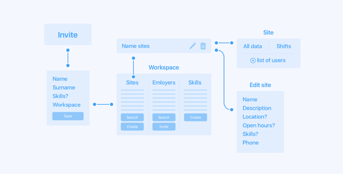
We established some key concepts, user types (superadmin, admin, manager, employee), versions of the app (mobile and admin panel for superadmin and admin), actions and their limitations and the structure of the app’s objects
User scenario
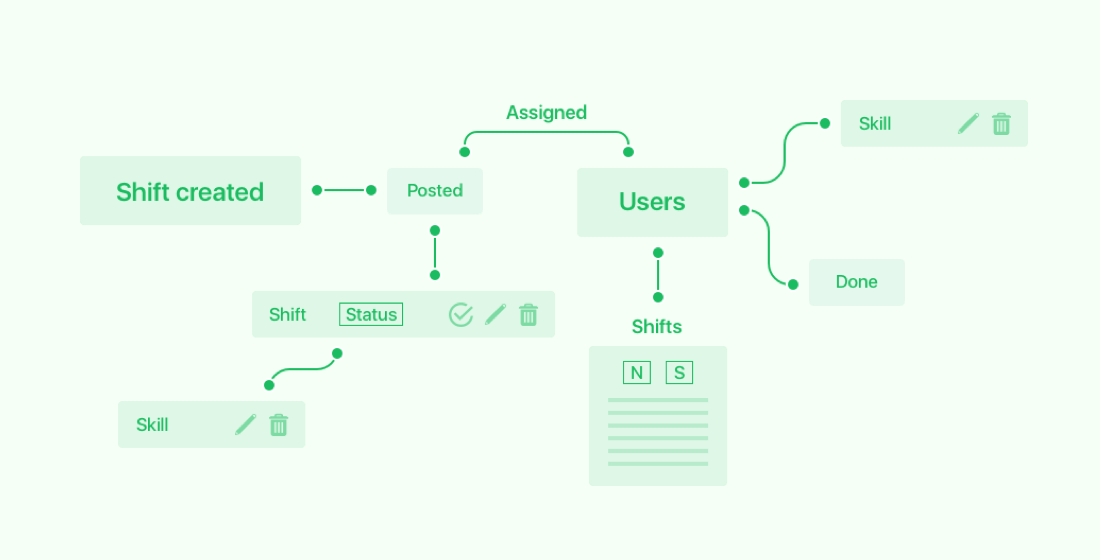
The scenario helped eliminate redundant actions and contradictions. For instance, we won’t let the user sign up for a task if the user already has one scheduled for the same time. We also got rid of the rejection process: instead, an employee simply ignores the task and it’s rejected automatically
Learn more about Prototyping stage
Workflow chart
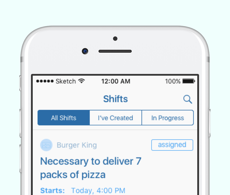
The workflow chart showed that tasks are the basic element of the app. To conveniently display and clarify the task execution stage, the following states have been issued to the tasks:

Prototyping
The prototyping stage helped sort out the details and eliminate ambiguities
Web prototype
When we started out with a web prototype, we had to change the app’s logic a few times
Check out the prototypeiOS prototype
During the iOS prototyping stage, we created different prototypes for managers and employees
Manager app prototypeUser app prototype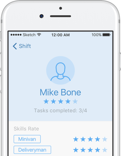
Design
The design stage opportunely coincided with the launch of iOS 10 beta. We researched the new versions of default iOS apps and snatched up a few solutions for ourselves
Loaders
Loaders are only present in screens where the user interacts with the app: profile editing, adding skills
Adding skills
The logic here is similar to that of the invitations in the default iOS calendar
Animations
The “Add” button is a joy to click over and over again. Animations were made using the QuartzCore framework and the CAAnimation class
System alerts
We ditched the default alerts in favor of pop-up tips
At the end of the design stage we made an interactive build of all screens
Check out the interactive final designDevelopment
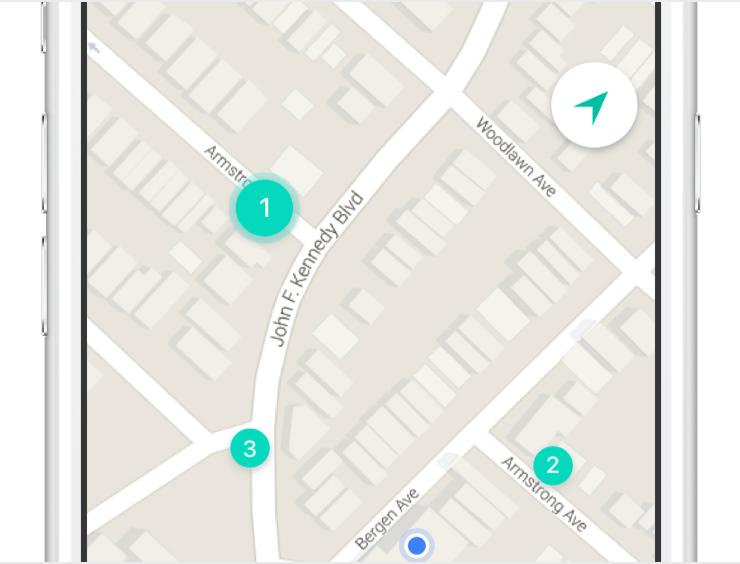
The map
The admin adds the objects to be available on the map. We used Google Maps because the default map app occasionally wouldn’t display buildings
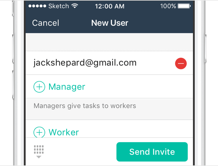
Invites
The employees get invited to the app by admins and managers. Group mailing to any number of addresses minimizes routine and frees up the manager’s time
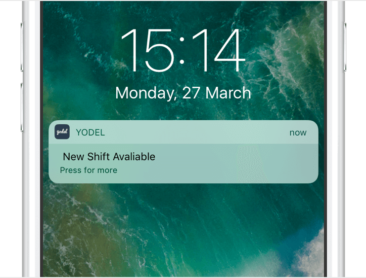
Push notifications
Implemented via FireBase notifications. Advantages: free, no limit on the amount of sent notifications (the app’s basic element), easy integration and decent flexibility with advanced targeting


