


Hello! In this article I’d like to talk about issues that can arise when implementing multi window mode on tablet versions of apps. Live Typing’s Android development team ran into these issues when adapting the
Sephora app for tablets, and you might want to be prepared to face these problems as well.
As you all know, in late August 2016 Android 7.0 was released. One of its main perks was multi window support, a great feature that takes Android’s utility up a notch. However, while users are always elated to have new features, developers may be in for some grief when new things come out. Unfortunately, this was the case with the introduction of multi window support on tablets — and only on tablets, as there seem to be no similar issues on phones.
The root of all evil
Let’s say you are a developer who has suddenly decided to introduce multi window support into a phone app. You’ve made everything by the book and designed for 320dp width. Well done, the new mode works without a hitch
and you are happy. Even if you’ve blundered a little and failed to implement small screen support and designed for 360dp or 480dp, you’re still good to go. The worst thing that can happen is that your layout
might get a little wonky or button text might split into two lines, but this is trivial and can be solved in a couple of hours, a day, tops. Well done once again, now you can put all the new multi window features
into your app.
But what if you have a tablet version of your app, too?
You will run into trouble — big trouble, likely. In fact, the kind of trouble that might get so out of hand that you’ll have
to drastically change the app’s architecture.
How multi window works on tablets
Screen orientation
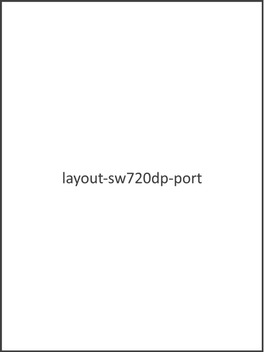
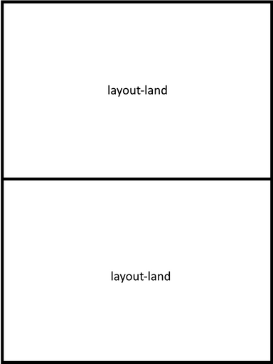
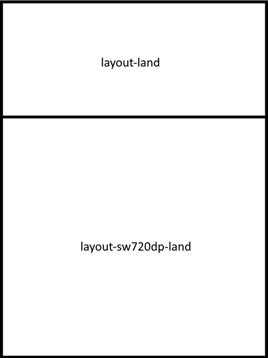
For the sake of simplicity, let’s imagine we have a layout for phones and a layout for 10 inch tablets. Let’s look at an example where our resources are located in the following folders:
-
layout-port -
layout-land -
layout-sw720dp-port -
layout-sw720dp-land
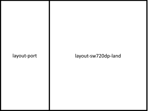
We will start with vertical orientation. Our app may take up the entire screen; in this case, the layout we use is in
Alternatively, it may take up one half of the screen; in this case, resources will be taken from
In case it’s one third or two thirds, resources will be taken from
You might expect that in landscape mode land and port will be swapped, but it’s not exactly true.
If the entire screen is taken up,
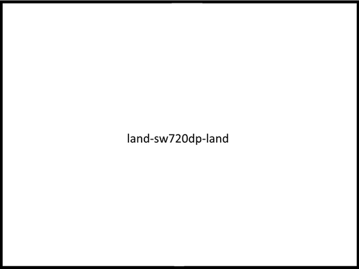
If it’s one half of the screen, it’s
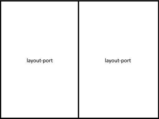
One third and two thirds are
Demo app
All right, we’ve figured out the layouts. Some of you might already see the potential issues, but first things first. Let’s imagine you’ve made a hypothetical app that works perfectly on Android 6, but will run into issues on Android 7. In advance, I would ask that you not criticize the way the demo app was designed, as it was made like this for demonstration purposes.
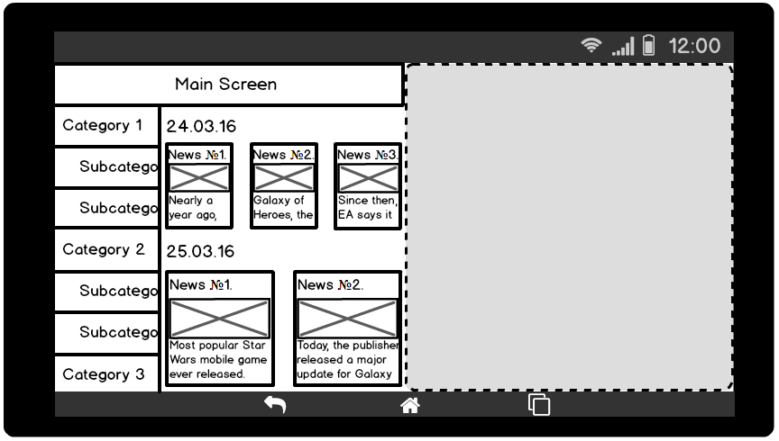
Let’s say it’s a news app that has three primary entities: category, subcategory and news. The phone version can only support portrait orientation and has three screens, each of them a separate Activity:
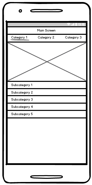
- The main screen. On it, we have general news categories that are located in the upper tabs. Inside each tab is a banner with the hottest news piece of the day. Below is a list of subcategories within the selected news category. Clicking on a subcategory takes us to a screen where its contents are displayed.
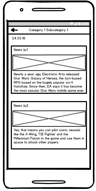
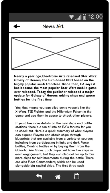
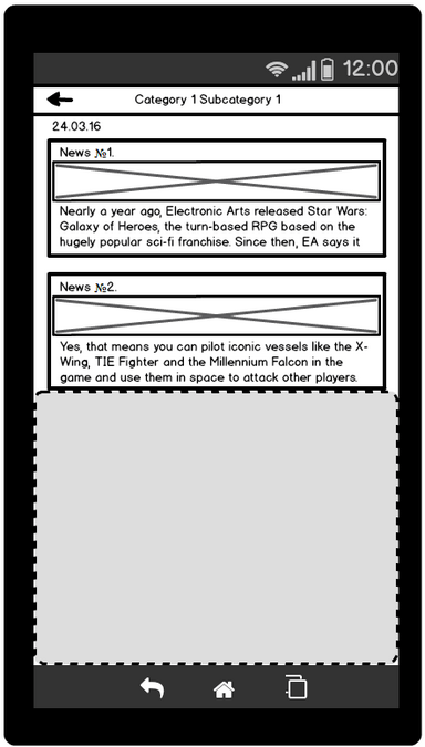
- The news list screen. Clicking on a news piece takes us to a separate screen where the news article is displayed.
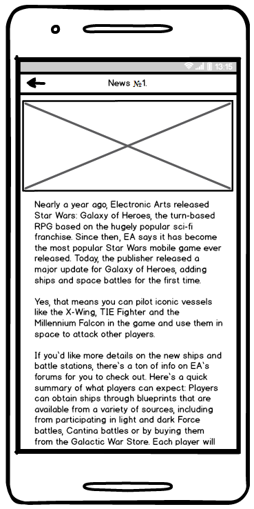
- Separate news piece screen. Here we display the news article in its entirety.
However, the tablet version is designed in a different fashion: there are only two screens that are also Activity:
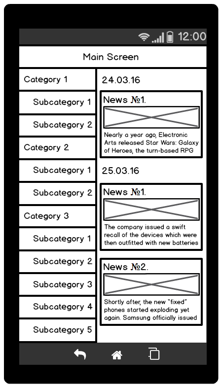
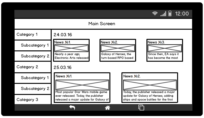
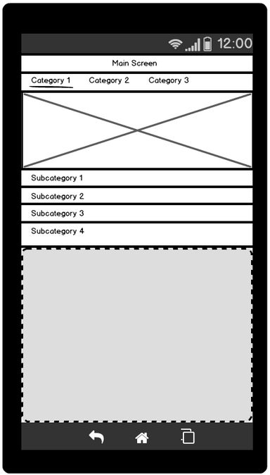
- The main screen. On the left is a list of categories with inlaid subcategories. On the right is the news list. There is also a feature unique to the tablet version: you can click on a category to see all the news inside it.
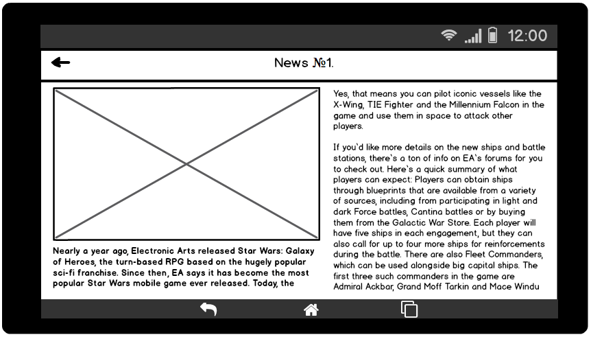
- Separate news piece screen. It’s mostly the same as the phone version, except that the layout is a bit different.
The app has MVP architecture and every screen has Presenter and View. For View, a custom ViewGroup like this one is used. Completely different View and Presenter are used for the main screen and the news list screen. The news article screens
in tablet and phone versions are absolutely logically identical, but due to significant visual differences we do require something more than just different xml’s. Hence, View implementation is done through an abstract
NewsView class that contains all the generic and inherited PhoneNewsView and TabletNewsView classes.
Let’s go a little further and imagine that we’ve launched our app on a 10 inch tablet under Android 7 and turned
multi window mode on.
Get the picture? Let’s see what we’ve got.
It doesn’t look perfect, because earlier, in the phone version, we didn’t support album orientation at all, and, as a result, it uses generic resources. Still, everything is more or less fine, the
banner is somewhat stretched, but it’s nothing serious. Content with the result, you click on a subcategory and get to the news list screen, and it’s not that bad either.
At first, you might be overjoyed, until you ask yourself: «What happens if I rotate the app and switch to tablet layout? After all, this screen is not supposed to be there under tablet work logic». That’s a good question, as the following would happen: a screen that isn’t supposed to be there will be displayed. What’s more, it’ll be its phone version that’ll ruin the visual design.
Problems
Problem № 1: if a screen from the tablet version combines several screens from the phone version, it’s going to be a mess
What could be the possible solution here? You could, supposedly, remake everything into fragments and place them over each other in the phone version and juxtapose them in the tablet version. However, you shouldn’t forget that it’s only relatively easy to do for our hypothetical demo app, while remaking a real app is guaranteed to consume a lot of time. Your real app might also have complex navigation that can’t be implemented using fragments because they can’t save states of their child fragments.
Let’s say you’ve remade your app into fragments, but then you remember about the special tablet feature — the ability to show all news from all subcategories of a specified category.
Problem № 2: if the tablet version has exclusive features that aren’t present in the phone version (or
vice-versa ), then you are in trouble
What to do now? You’ll either have to add these features into the phone version or remove them from the tablet version. As you may see, in reality there can be quite a number of such features, and attempting to coordinate everything will make you pull your hair out. It’s a lot easier in our small demo app that has very few features, but in other cases this will require a ton of work.
Alright, the list category may seem OK, you’ve tweaked and debugged everything, good for you. You open up a news article screen and try to go multi window mode, when your app suddenly crashes — oops! What was that? Thing is, your PhoneNewsView and TabletNewsView have the same id, therefore, onSaveInstanceState is done for one class, and onRestoreInstanceState for another.
Problem № 3: if in xml’s of tablet and phone versions different classes have the same id, you’ll waste a lot of time fixing this
Is there a way to avoid it? Of course, you can assign them different id’s, but then you will have issues with state saving when the multi window mode is switched — to put it bluntly, there won’t be any state saving at all. There is another way: you can arrange everything so that there is no difference in the code between phone and tablet versions apart from xml. If you desperately need to add a new element into the tablet, it’s better to just check it for null and then do whatever you need with the element.
All right, you’ve solved this one. Then you realize that in the same screen in the phone version, right under the news image, you have a text that says something like this: «If you own a tablet, try out our app’s tablet version." Sick! Of course, it’s trivial compared to our previous problems, but still nothing to be proud of.
Strictly speaking, this doesn’t constitute a Problem № 4; I just wanted to show how you could get tablet resources even if the app was supposed to get phone resources.
What can we do? If in multi window mode we get resources from Application, it’ll return them for the tablet; if we get them from Activity, View, Fragment and anything else that isn’t Application, it’ll return for their size. That is, if you split the screen in two, Application will return tablet resources while everything else will return phone resources. I think it has something to do with the fact that, in theory, an app can be split into several windows. Perhaps, a lot of people had the brilliant idea to make setContentView in Activity not by id, but by View previously inflated with the help of Application. However, I DO NOT recommend doing this, because your app will end up looking like this:
With the help of Application, you have solved the issue with the unwanted line. Contented with your work, you kick back and think why Google introduced so many extra case studies and how harder will an Android developer’s life become now.
Important note on Android SDK
To be fair, Google’s multi window support is absolutely fine. Why are there issues with tablets, then? The reason is that there is no such concept as a «tablet» in Android SDK… at all. There are small, medium and large screens, but no such thing as a «tablet». Therefore, it doesn’t need any separate logic for tablets and no extra functionality.
It’s not Google’s fault, really, it’s just that there was never supposed to be such a thing as a dedicated tablet app. The dedicated tablet app craze came from iOS where this concept actually exists, and, as a result, there are ways to make such an app.
The way I see it, Android apps are more like Web in this regard: you have a page and a certain data set and your job is to make everything look nice on all screens and in all browsers. Does this remind you of anything — varying screen sizes and enormous device fragmentation, with each device having its quirks? Sounds similar to me.
The thing with the issues I’ve described is that they weren’t supposed to be there at all. Still, I hope I helped you find your way around them if you needed to, or, better yet, prevented you from running into them altogether. Take a look at Google Play: you can open it on any device and it’ll look good, or at least decent, because it was initially created with various screen sizes in mind, even if the data set always stays the same.
This is a very good way of doing it. You can change the amount of columns, offsets, element size, hide or show elements — anything; the general logic and data set must stay unaltered. In my personal opinion, this is the foundation of a great app.
Of course, this is a