I have a dream, albeit a utopian one — I want all of my web apps to work perfectly. JQuery, AngularJs, React, Vue.js — all of them promise performance, but the issue lies neither in the frameworks nor in JavaScript. The problem is the atrocious way the browser renders the page.
If the browser handled rendering well, there would be no need for a tool like React Native. Under the hood, React Native is still JavaScript, and View is native. The difference in performance between a native app
and a React Native app is unnoticed by regular users. In other words, JavaScript is not the problem.
If there’s something in dire need of optimization, it’s rendering itself. The tools provided by JavaScript and browser API are insufficient. For two years I’ve tried to make my products work smoothly and quickly,
but in vain. I’ve almost come to terms with the fact that Web will always work like this. However, in this article I’ve collected everything I’ve learned about rendering optimization and things I implemented
in my projects. I’d also like to tell you about my hopes for the nearest future — the kind of future in which I could have a stable foundation of standards and browser API instead of CSS
hacks and third party repositories for performance optimization.
Hybrid apps and performance
The apps I used to write had rather trivial functionality: they were newsfeeds with comments, categories and tags. You could watch videos and search by news in them, they had push notifications — nothing too complex. As I had to sign NDA’s, I can’t show you these projects, but you can check out the principles according to which we select our approach to mobile development in our company’s blog.
Hybrid app development is a great area to work in. I was perfectly fine with JavaScript and interface elements generously provided by Framework7 and Ionic. There were enough plugins that allowed using native features. I could
write one app and get ten apps for all imaginable platforms. Sounds like a dream come true, but there is a huge catch that ruins everything.
Whenever an app became more sophisticated than «Hello, world!», performance issues would surface. The app would work better than the mobile version of the website, but it’d be far from the performance of an equivalent native app.

While some of us could live with this, I took it as a challenge. I set out to write a hybrid app that couldn’t be discerned from a native app solely by its performance. After some digging,
I came to the simple conclusion that there was nothing wrong with JS, and that the issue was with rendering. I went through all the CSS hacks from transform: translate3d(0,0,0) (that soon
stopped working) to replacing
- Force Hardware Acceleration in WebKit with translate3d
- 60fps scrolling using
pointer-events : none - CSS
box-shadow Can Slow Down Scrolling
Later I worked on other projects that had nothing to do with mobile browsers and devices. Everything functioned without any performance issues, which didn’t come as a surprise when working with more powerful hardware. However, just because problems with performance aren’t obvious, doesn’t mean that everything is optimized.
Medium, you’ve got a problem
There are countless feeds in apps and websites like Instagram, Facebook, Twitter, Medium and so on. The examples are so numerous you could put them in a list and display it in a feed of its own. There’s nothing wrong with feeds, of course. Scrolling allows the user to move both within one post or go from one post to another at their own leisure. Feeds also allow you to add as many new elements into the list as you want, as I most certainly did.
Let’s run an experiment. Is your cooler fan noisy? Fire up Medium.com and start scrolling down. How long will it take you until your fan gets to maximum RPM? My result was about 45 seconds. And it’s not Chrome’s fault,
and my several years old laptop is none to blame, either. The problem is that nobody bothered to optimize what we see in viewport
What happens when we scroll the feed? When we’re at the bottom of the page, we get a few more posts from the server and they are added to the end of the list. The list grows indefinitely, and the browser does…
nothing. Yes, the posts at the top of the feed are still there, rendered by the browser. And «visibility: hidden» doesn’t solve this issue even if we hook up this property on each post outside of viewport.
By the way, I noticed this failed attempt at optimization in Ionic. Later, it was removed. If you are interested, here’s the topic on the Ionic forum that I created to discuss the issue.
The mysteries of optimization
So what prevents us from writing decent, optimized code? The thing is, we don’t know much about the process at all. Most knowledge we get comes from trial and error, while articles with titles like «How the browser renders the page» merely tell us about how HTML combines with CSS and how the page is split into layers. They don’t inform us about what happens when we add a new element into DOM or add a new class into the element. Which elements will be recalculated and rendered in this case?
Say we’ve added a new element into the list, what next?
- The new element has to rendered and put into place
- Other elements of the list have to be moved anew
- Other elements of the list have to be rendered anew
- Parent height has to be refreshed
- Parent has been refreshed, and it’s not clear whether the surrounding elements have changed
All the way to the DOM root — as a result, we render the entire page.
Rendering in the browser works differently. Here’s one of many articles about it that details the process of combining
DOM and CSS trees, and how the browser then renders the result. It’s all fine and dandy, but it doesn’t explain how the developer can help the browser do it. There is an unofficial resource called CSS Triggers with a spreadsheet that helps determine which CSS properties call Layout/Paint/Composite processes in the browser. Seeing as pages usually contain a lot of styles and elements, the only viable course of action is to simply
avoid anything that can hinder performance.
In general, optimization process is about finding a solution to following issues:
- Improving CSS efficiency and making styles readable for the browser
- Getting rid of
hard-to-render styles (shadows and transparency are best avoided altogether) - Decreasing the number of DOM elements and introducing as few changes into it as possible
- Proper usage of GPU.
All of this helps to speed up page rendering, but what if you want to know more?
Dropping irrelevant content

The way I see it, the only method that really works is making the page only display elements the user actually needs. Implementing this behavior is not a simple task, though.
A lot of you know about Virtual list, Virtual scroll, Grid View, and Table View. Different names, same essence: it’s a component for efficiently displaying very long lists on a page. Such interface components are most often
used in mobile development.
GitHub is full of JS repositories akin to Virtual list, Virtual grid, etc., and they do work as optimization methods. In a list of 10,000 elements you can create a container as tall as 10000px
multiplied by the height of one element, and then follow the scrolling and render only the elements the user sees plus a bit more. The elements themselves are positioned with the help of translate: transformY(<element index> * <element height> px).
I’ve been studying Vue.js 2.0 recently and have written a similar component myself in a couple of hours.
There are several ways to implement this, and the difference lies only in how we position the elements and whether we split them into groups. It’s not critical, though. The problem is that in perfect conditions the scroll
event triggers as many times as the amount of pixels scrolled — i.e., a lot of times. Throw in the fact that calculations have to be handled on each event trigger as well. On mobile
devices, the scroll event and the scroll mechanics work differently. This leads us to the simple conclusion that scroll event is not a viable solution.
There’s also another issue worth mentioning. All the components I have seen require that element sizes be equal or at least
IntersectionObserver

Enter IntersectionObserver, the first ray of hope for the future I dreamed of above. This is a new feature, so you can go check the info on browser support on the caniuse.com website. Here are some extra materials about it, too:
- Draft Spec
- Repository with the Draft Spec and an explanation with examples and Polyfill
- An article with demonstrative examples in the Google blog
IntersectionObserver notifies when the element we require appears and disappears in viewport. We don’t have to trace scrolling anymore and calculate element height to determine which of the elements we have to render.
Now for some practice. I felt like creating virtual scrolling with element preloading using IntersectionObserver. The task implied that:
- It’ll be a boundless feed with posts that each have a header, an image and some text
- Post content and height are unknown
- There would be no delays for content loading
- It’ll maintain 60 FPS
Here’s something I learned while writing this component:
- You have to reuse elements, while DOM operations should be minimized
- You don’t have to create IntersectionObserver for each list element, two are enough
The basic idea
The content is split into parts that each contain 12 posts. When a component is initialized, DOM contains only one such part. The first and the last parts have a hidden element on the top and on the bottom accordingly, and we do follow the visibility of these elements. When one of these elements appears on the screen, we add a new part and delete the one we don’t need. As a result, we have two parts with 12 posts each in DOM simultaneously.
Why is it more convenient than following scrolling? If post height is unknown, we have to find the element in DOM and determine it, which is bothersome and bad for performance.
In this case, we get a component that can quickly render infinite content with undetermined height. Similar things can be used for things other than newsfeeds — basically, for any content that’s made out of units.
Enough said: here’s a demo. I will remind you that the idea here is to see how IntersectionObserver works in real use.
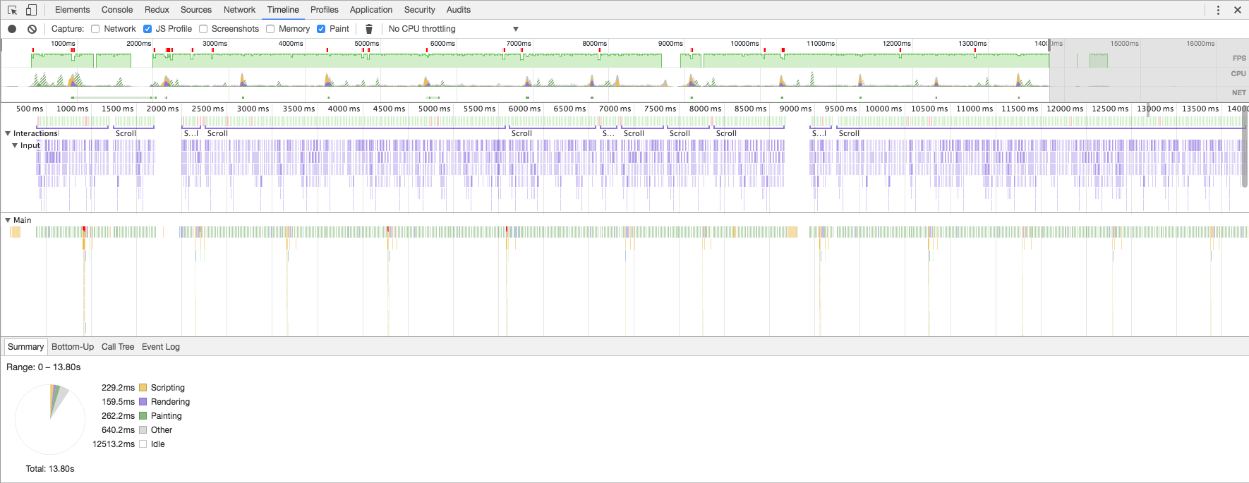
Check out the FPS we get when we scroll at the approximate speed of quickly surfing through the feed (image is clickable):
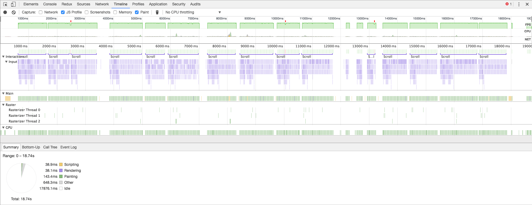
Or when we scroll as fast as possible (image is clickable):
FPS very rarely drop below 60, and only for a couple of frames and no lower than 45. An excellent result, taking into account that the browser doesn’t know image and text size in advance.
Conclusion
Actually, this isn’t the most impressive and instrumental example of using IntersectionObserver. It’s much more interesting to try and use it in conjunction with React/Vue/Polimer components. It’s possible to hook up IntersectionObserver on a component on its initialization and continue the initialization only when the component is in viewport. This opens up a lot of opportunities. Let’s keep our fingers crossed and hope that IntersectionObserver will make further progress.


