Website builders grant their user a certain degree of
Solutions offering
pre-made themes
In these services, the visual editor (or WYSIWYG) handles only the content and has no impact on the design.
Squarespace
Because unusual solutions still require the presence of a developer, Squarespace is a favorite among pros. The service is already large enough to simply advertise itself as a way to purchase domain names.
Wix
Wix is promoted as an
Weebly
This one asserts itself as a complex solution: it’s a website, a store and a set of marketing tools all at once. Indeed, Weebly’s templates and essential blocks may very well be enough for a small
enterprise.
Solutions based on a fancy editing tool
These solutions have
Webflow
Definitely a top notch tool, even if it won’t let you whip up a website in a couple of seconds. In fact, it looks more like a way of being a developer without having to touch the
code. All in all, it’s very
Readymag
This one is aimed at creating magazines, presentations and other publishing stuff, but the gallery is impressive enough to make you wish you could design something half as good.
Tilda
Tilda is intended for creating websites, landing pages and presentations. This service is a perfect blend of smooth learning curve, convenience, pricing, flexibility and complexity, and it’s also capable of exporting the
result to your website without being
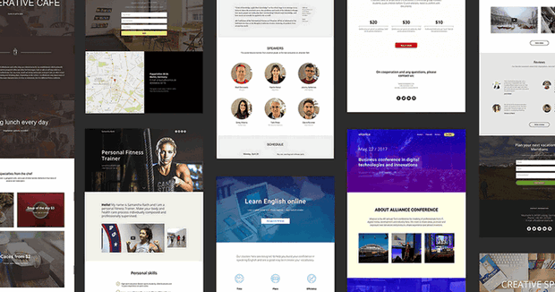
Responsiveness is one of the essential requirements for a website today, and Tilda handles it beautifully: each block is 100% adaptive to the user’s screen size. Over 350 blocks are
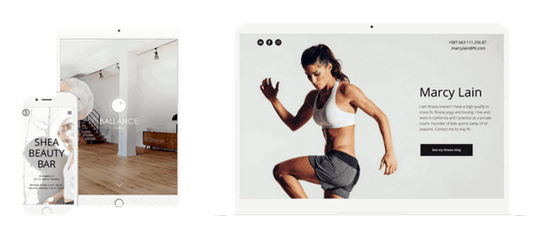 Each template can be opened and looked through so you can see what blocks and parameters it’s made of. Forms, mailing, CRM systems, payments,
scripts and other integrations are already there and are easy to add.
Each template can be opened and looked through so you can see what blocks and parameters it’s made of. Forms, mailing, CRM systems, payments,
scripts and other integrations are already there and are easy to add.Tilda doesn’t force any decisions; it simply offers you the building blocks for constructing your own lovely, cozy house.
Tilda for marketing experts, editors, managers, journalists
Tilda is the best mix of simplicity, functionality and low pricing among all of the website builders available today. In a way, it’s similar to Instagram: it’s easy to make reasonably
 At the same time, Tilda can let you roll out the big guns whenever you want to even if you don’t know how to code —
and you don’t have to obsess over margins and padding as these are handled by the interface itself.
At the same time, Tilda can let you roll out the big guns whenever you want to even if you don’t know how to code —
and you don’t have to obsess over margins and padding as these are handled by the interface itself.Zero Block is just the icing on the cake. It gives you a sense of freedom when you position your objects, allowing you to safely break free of the same old templates.
Apart from the tool, there is also a wealth of regularly released examples, useful articles and new blocks.
The Tilda team provides you with the best ways of working with your content and its presentation, smoothing out the learning curve to let you get the best results. At the same time, it’s an irreplaceable tool for all the diligent,
If you have something to say, let Tilda pick the right words for you.

Tilda for designers
Interestingly enough, some designers and studios create websites using Tilda and are quite open about it; in fact, they build their image entirely around this remarkable tool.
 Relationship with Tilda is a matter of professional trust: if you respect the authors and have no doubts about their competence,
this is a great service for you. Tilda was founded by Nikita Obukhov, a designer with an enormous track record of
Tilda for developers
Some developers don’t like to work on the layout, some want to involve themselves only in new and exciting projects, and some are concentrated entirely on JavaScript programming. Tilda caters to all of them: everything you make on Tilda can be easily exported to your server by copying the source files; the Wordpress plugin is already in there and you can use the API at any time.
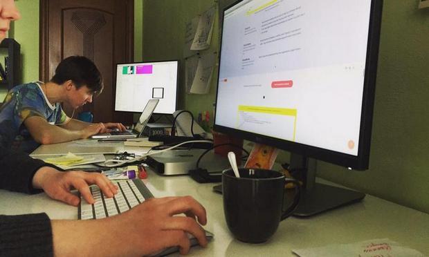
 At Live Typing, we use Tilda to make project case studies. As it was already mentioned, this saves time: the designer skips the
Tilda for everyone
Tilda has a selection of tutorials, a useful blog, a
- find an image;
- create a website step by step;
- create a quality long read by telling a story.
The editors occasionally publish new features and templates and demonstrate how they work using
- A course page template;
- A website for an event agency, a webinar or a workshop;
- a beauty salon;
- an enticing job offer.

If you still don’t have a website in 2017, the easiest way to get one is to build it with Tilda. Statistically, your website has probably already been built using WordPress, but even in this case you can use
Tilda to complement your website with an awesome promo section or a landing page.


